
An insight into the design process to deliver a modern betting interface for Australian bookmaker betting.club.
Disclaimer
To comply with my non-disclosure agreement, I have omitted certain confidential information in this case study. The information in this case study is my own and does not necessarily reflect the views of betting.club, Artisan Digital, Stride Solution or Total Betting Solutions (TBS)
Overview of my role
Member of the design team of customer facing betting.club products for web, iOS and Android.
Specifically I was tasked with contributing to -
- Working with the client and users to design low and high fidelity interface solutions.
- Designing and building a branded visual system and user interface library
- Creating and maintaining solid, responsive and scalable production ready HTML and CSS
Context & Challenge (the brief or the conversation)
Project background
Betting Club is an Australian owned and operated bookmaker. They were looking to establish a presence in the local racing and sport online wagering market with a new end-to-end wagering platform.
Artisan Digital(Design), Stride Solutions(Development) and Total Betting Solutions(Betting Engine) had been working together in the build up to this project. We were ready with a host of new ideas to propose to a client with the right requirements.
The problem (the why?)
The online wagering space in Australia is well established with a few large internationally backed operators with large marketing budgets. Smaller and locally owned operators struggle to compete on price driven offers and promotions making it difficult to grow their client base. The industry offering of website and app features is fairly similar amongst most brands.
Project goals and objectives
Our challenge was to design betting.club a responsive website and native apps. They would include features and functionality that were first-to-market and unique to the their brand. These features would drive customer retention and allow the brand to be a point of difference to the other competitors in the market.
The time frame was to be live for the Melbourne Spring Racing carnival. This is an essential revenue generating period for any online bookmaker. Couple this with an aggressive scope and we would face time and work flow challenges.
Working within these constraints we needed to determine which features could be ready for release one.
Process & Insight (discovery) (how we got from the challenge to the solution)
Design process
The first part of the process was to determine what was being delivered. As a team we sat down with the Project Manager, Project Analyst and key stakeholders to estimate effort for each task. We then set these tasks into a priority order and worked back from the release date to determine what we could commit to for the first release. If we got ahead of schedule we would try and include extra items.
Agile teams formed the basis for our work flow. We worked in two week sprint cycles to deliver complete chunks of the project. Designers and developers met each fortnight to commit to tasks for the two week sprint with the design team working a sprint ahead. What was designed in one sprint was developed in the next.
Research
As a design team we lent on our experience to come up with a list of features that would meet the project goals. We knew we specifically wanted to incorporate various social aspects.
We invited a group of users of varying betting experience ranging in age from early 20s through to early 60s. We held a question and answer session to establish which of these features they would like to use.
From this session we knew we wanted to focus on the following areas for the first release
- Include a social element to the site
- Improve site navigation
- Improve the bet placement process
Yet we needed to always be mindful of this feedback, gained during interviews
- Speed and ease of use is the most important thing when placing bets as it is often time critical
- Ensure we maintain a users location within the betting market areas. Any new features must accessible from these areas
Workflow
Due to the time constraint we decided on a process of low fidelity mocks, designed in the browser. We could test our designs and iterate on them while achieving quick hand over to the development team. The developers accepted there would be some refactoring of code during the application of hi fidelity design. As a team, we were conscience to avoid this when we could by aiming for CSS changes only during the hi fidelity stage.

We fired up our project starter kit which we’ve refined over many projects. We take a fork from our private GitHub repository and get started. We use inuit css as our css/scss foundation with our layer of ui elements on top. InuitCSS by Harry Roberts is an unopinionated group of interface extractions that allows us to write our own css around. We’ve loved working with it because it is light-weight and you can customise it for each job.
To produce static low fidelity designs we used the blogging platform jekyll. It allowed us to break up our html into partials and write conditional variations into our designs to display different visual states. Outputting realist data was simple and allowed us to test edge cases in our designs before we hand them over to the developers.
To make all our lives easier we use grunt to automate various tasks. Auto prefixing css attributes, minifying images and live reloading of browsers helps speed up our design process.

During the low fidelity process we produce a project UI library. This is a document with a visual representation of each component. This ensures that each designer maintains consistency.

For our app designs and hi fidelity compositions we used Invision to gain client approval.
Example of the iteration
Below is an example of an iteration of the main site navigation. The goal of this design was to reduce page scrolling by introducing a tabbed navigation instead.

The feedback was that the tab design had merit but perhaps not enough of the key racing information was immediately available to the user. It was also suggested that it was straying too far from what users were familiar with. Racing bets still account for the majority of revenue in Australia. We decided we should streamline it. We ended up deciding on a racing and sports tab and moved the social and account information into a secondary menu.

Managing Feedback
One of the toughest parts of the project proved to be handling the feedback of the wider team whilst moving the designs forward. We often spent an unwarranted amount of time debating viewpoints without any basis of research or data.
Once we identified this we tightened up our internal feedback loop and circulated designs before meetings. We enforced feedback deadlines so we could review it before heading into group discussions. The feedback became more focused and concise than thoughts formulated on the run during the meetings. Team members felt they were still contributing to the design discussion.
Solution
Allow users to connect and share tips, wins and form
Allowing users to send and receive connection (friend) requests opened the door to sharing discrete bit of information. This includes tips, wins and racing form. Our research indicated that the online sports and racing betting experience is lacking a social aspect. Attending a race meet with friends and putting on a group quaddie, watching a footy game with a group of mates where all social activities. This provided an opportunity to take some of the social sharing elements online.
We identified during our user testing that we needed to include a way to acknowledge a tip received. We had included a ‘cheers’ feature, similar to a ‘like’ in our design comps but ultimately we didn’t have the time to implement this feature from a development point of view prior to launch.

Introduce an activity feed that keeps users updated with site information
With the introduction of shared tips, wins and form, we needed a intuitive area to house this information. This gave way to the idea of the activity feed. On the desktop it would be a permanent fixed panel and on mobile it would be off canvas but accessible. Most social media platforms utilise a feed so users were familiar with how they work.

Allow users to follow your favourite competitors (black books)
Once users establish a connection they can see each others Black Books, also known as favourites. This feature is user controlled and be turned off. Black Books for each user appear in the market area with accompanying comments.

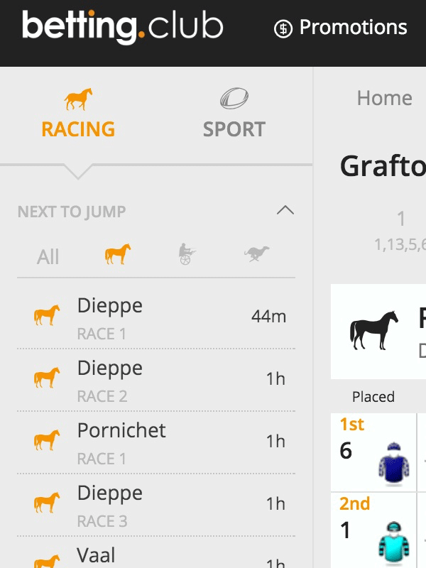
Improve the site navigation
We improved the site navigation in two key areas. A two tabbed menu that reduced the need for scrolling and we also included quick access to the daily race card. Our user testing group suggested having a quick way to jump to any race, at any venue, would be beneficial to last minute bet placement.
Improve the bet slip
We added an overlay state to the bet slip to handle more complex bet types and free bets. This simplified the bet slip with secondary information hidden behind a click interaction. When a user has a free bet indicator they can expand for more details.

Create a visual language
For performance reasons we included only a single extra typeface. We decided on Open Sans via Google Fonts. Open Sans is legible from web to mobile and works well at small sizes which is important in a complex interface. It’s large number of variants allowed us to create a clear typographical hierarchy.
Results
We delivered the site one week prior to the main betting weekend of the Spring Carnival. Success on the time frame objective! Just as importantly, betting.club were first to market with a set of new features that were unique to their brand.
We observed that sharing of tips was popular amongst users but being unable to acknowledge the tip received was some of the feedback from users of the live site. This came as no surprise but in post-launch clarity we should have included the ‘cheers’ feature for release one. Even if this meant some other feature was de-scopped.
Based on client feed back we learned the two level menu needed a seperate popular markets list. We have since included this feature. It sits above the tabbed menu.
The interim bet slip was well received with a seamless take up by existing users. It’s been described as a much improved process for placing complex bet types.
Now that the site is live we can get to work on implementing any feature gaps. We’re planning to run weekly client catch ups to flesh out new features and enhancements. Sharing wins, Personalised user avatars and better onboarding are just some of the upcoming planned features.
Personal key takeaway and what I learnt
Faced with a tight timeframe perhaps a better approach to product delivery is to focus on the one or two best features. These features can be richer and more tested.
Being quick to launch does train the users to expect regular releases with new products and fixes.
We identified a better process for managing internal feedback and this is something that will be explored more in future projects.
Our tight working relationship with the development team affords us many benefits for speed to market but our process still needs improvement.
I learnt that my personal productive sweet spot is just slightly out of my comfort zone but not too far. Challenging but not daunting targets seem to bring out my best work.