Chris Feddersen
How we redesigned Kmart's Product Listing Page — by letting the data lead
Kmart | July 2024 | PM, BA, Design x 2, Flutter Dev x 3, Web Dev x 1, Backend Dev x 1, Tester x 1
The problem
Customers use the Product Listing page (PLP) to quickly evaluate a range of products. There were 214m sessions on the PLP over 12 months. But too many customers were abandoning the PLP and going elsewhere before ever reaching a single Product Details page (PDP). When a customer views a PDP they are more likely to convert so the further we can get them through the funnel the better.
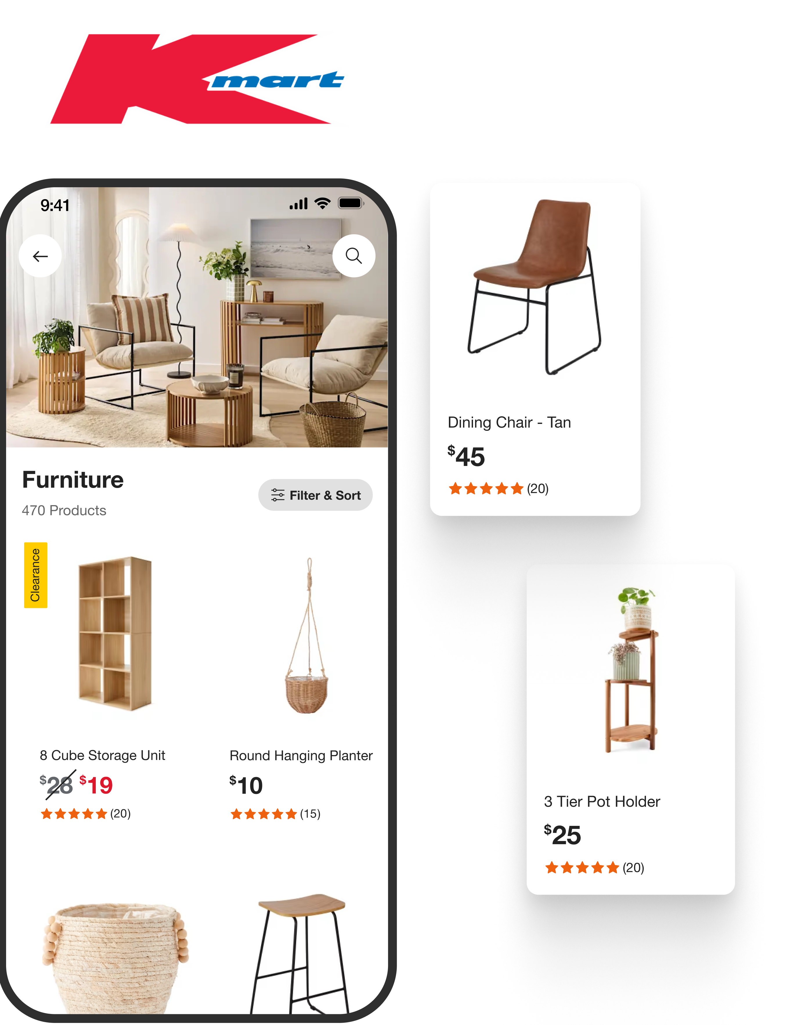
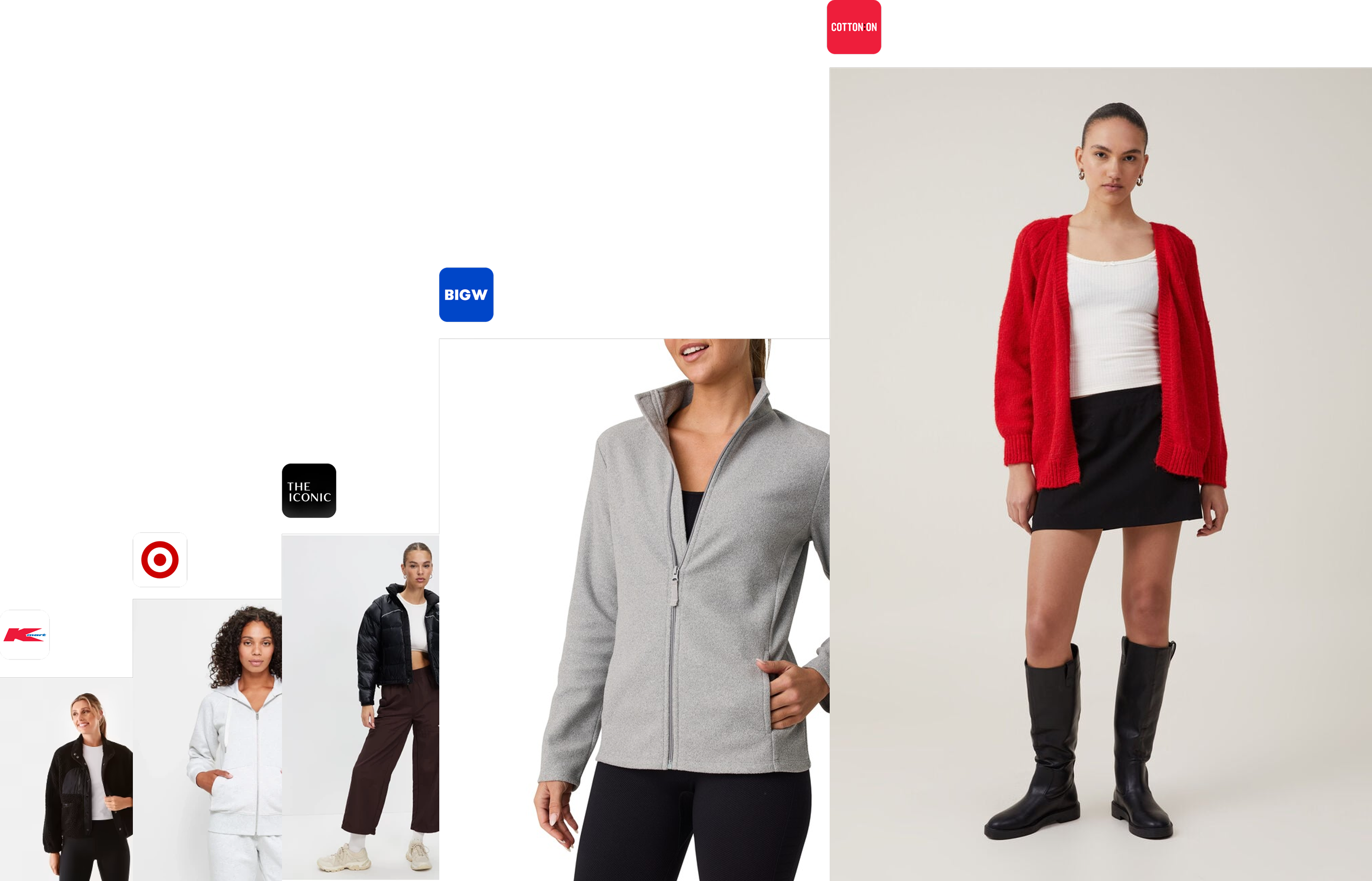
The original Kmart web product listing page (PLP) and also a web-view within the native app
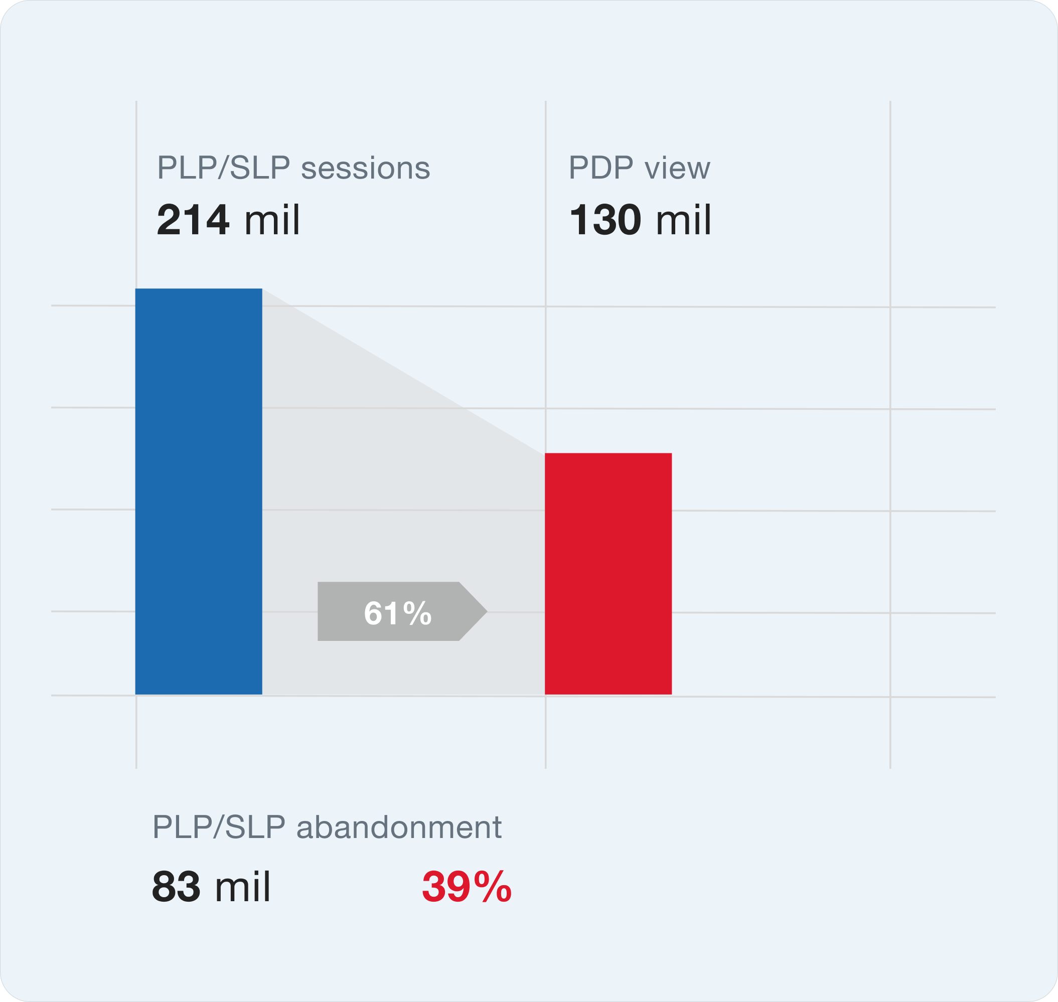
Getting customers to a product details page (PDP) significantly improves the chance of conversion into a purchase
Insights
We interviewed customers every week through our Continuous Discovery process and a number of common themes emerged. Customers were pricing driven. It might seem obvious but as a low cost retailer it was the most important driver. Customers were using the PLP to evaluate lots of products. We would ask them to share their screens and shop normally — they would often view dozens of products without clicking on a single one to go through to the product detail page to find out more. This same pattern was observed in our Google Analytics data. Customers were also searching quite broadly within a category. They might be searching for a particular subcategory e.g. leggings but would be scrolling through a full range of activewear. We mapped out these pain points, our assumptions and some solutions to work out how we might validate these.
We tested image quality to price formats and navigation.
Stakeholder challenge
The biggest challenge was managing stakeholder expectations. Some key stakeholders had their own thoughts on solutions. We interviewed stakeholders individually to understand their underlying needs.
In an early workshop, our key sponsor requested a specific feature: the ability to swipe through multiple product images in a mini-carousel format. Rather than taking the request at face value, we unpacked the underlying need.
The feature request was a carousel. The underlying need was confidence. The better solution was sharper images.
What they actually wanted was for customers to have more confidence that a product matched their expectations before clicking through to the PDP. This framing opened up alternative solutions and kept us focused on the outcome rather than a prescribed feature. Could we still present a higher quality, better framed image instead?
Our image size compared to competitors. A larger image, sized down to a standard product tile will appear a lot sharper. This is especially evident on high resolution mobile devices
What I did
I led discovery, UX design, user flows, and low-fidelity designs. I facilitated user testing and worked closely with developers and a junior designer on UI.
I partnered with an optimisation specialist to run A/B tests on the mobile website, measuring the impact of:
- Price format adjustments — increased conversion by 10% (2.5% to 2.75%)
- Image quality and orientation improvements — drove conversion uplift from 2.76% to 2.84%, contributing to multi-million dollar revenue gains
- Exposed filters for price and subcategories — improved navigation and engagement, contributing to multi-million dollar revenue gains
Why we tested on mobile web first
We could test directly in the app, but two constraints made mobile web a better proving ground:
- Dev capacity — the app team was focused on the Flutter rebuild
- Release cycles — app changes required an app store release, while web deployed daily
This let us validate ideas quickly and bring proven wins into the app build.
Limitations of this approach
If we needed to test a very mobile-specific pattern and the web team hadn't built that component, we couldn't get a perfect read. But we could substitute UI and still get confidence in the overall approach before committing to native development.
The results
Before we delivered final PLP designs we already had wins. Starting with fundamentals and experimentation gave us space to evolve safely. Stakeholders initially pushed for a full redesign. We knew that building trust through incremental improvement gave us a more stable foundation for future layout and view-type experiments.
- Page load time: 6 sec → 2.5 sec (-58%)
- Conversion (price format): 2.5% → 2.75% (+10%)
- Conversion (image quality): 2.76% → 2.84% (+3%)
- Incremental revenue: multi-million dollar gains from image quality and filter improvements
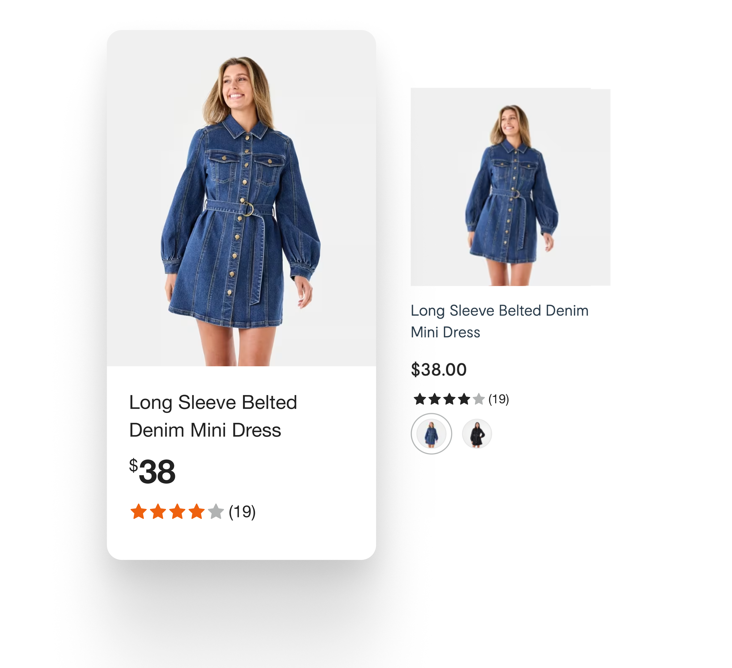
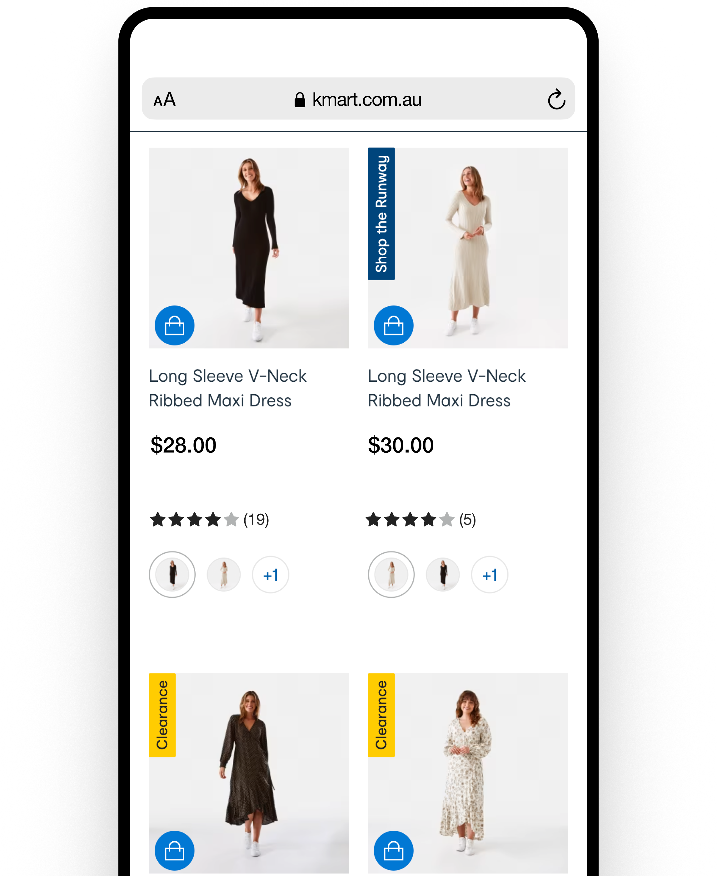
Before and after product tile: improved image quality, orientation and price formatting
Broader impact
- Target adopted the wins — the success of these experiments led to their adoption by partner brand Target, an unexpected but positive outcome
- Blueprint for future work — using mobile web as a proxy for app testing became a blueprint for future feature development, later adopted for the checkout redesign
The hard trade-off
Going all-in on native Flutter meant taking on full maintenance of the product listing page. When it was a web wrapper, we relied on the web team to do most of the work.
Eventually there was a change in strategy and we reverted to the optimised web-view — but adopted the wins from this project. The performance improvements, conversion uplifts, and exposed filters all carried forward.
What I'd do differently
Looking back, I would have considered major seasonal events earlier in planning — particularly Black Friday.
These were times when we needed to make quick changes to the product listing page. The native app approach made release planning rigid, which created friction during peak trading periods.
This was ultimately one of the key reasons we reverted to the optimised web-view. If I'd factored seasonal flexibility into the original strategy, we might have made different architectural decisions upfront.
Key takeaways
- Test where you can move fast — mobile web as a proxy let us validate ideas daily instead of waiting for app releases
- Unpack feature requests — the carousel request was really about purchase confidence; framing the underlying need opened better solutions
- Consider operational constraints — technical decisions have downstream effects on release flexibility and team ownership