Chris Feddersen
When more friction means less frustration
Sendle | January 2026 | PM, Lead Front-End Engineer, Design (sole designer)
The Problem
Sendle is Australia's first carbon-neutral delivery service, helping small businesses ship parcels. The claims process for lost and damaged parcels was generating significant support overhead.
Customers submitted incomplete forms, triggering multiple follow-up emails and extended ticket handling times. The goal was to redesign the claims journey to capture complete information upfront.
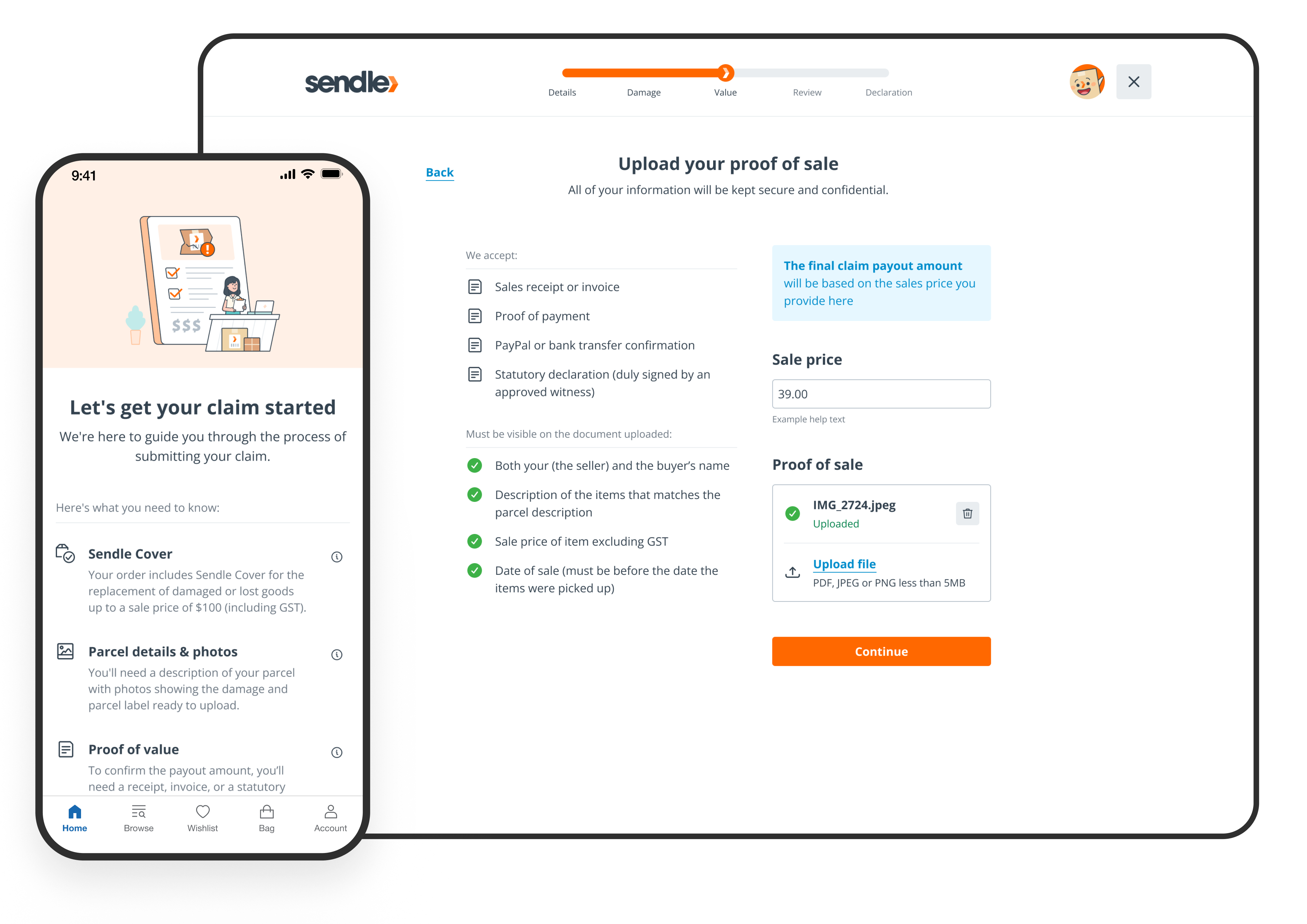
Original claims process was a single long form
What I Did
I led end-to-end discovery and design as the sole designer on the product team, creating MissionMode — a reusable stepped-journey pattern built for jobs-to-be-done flows.
- Designed the claims journey using MissionMode, introducing positive friction to ensure complete submissions — including save-as-draft functionality used by 1 in 4 customers
- Structured components with Figma variables and consistent layer naming to speed up prototyping with Figma Make — this groundwork unexpectedly enabled a faster path to code
- Partnered with the lead engineer to connect our Figma design system to Claude Code via MCP server, allowing 90% of claims screens to be built in hours versus the estimated 2-week timeline
MissionMode was a new design pattern for Sendle. A reusable UI flow for key jobs to be done. It's core purpose is to provide a distraction free, guided experience that makes complex tasks simple and efficient
Why We Chose Positive Friction
The redesign had a guardrail metric: improve the experience without increasing what we paid out in claims. If we made the process too easy, we risked higher payouts. But we also couldn't make it harder for customers with genuine claims.
The balance came from two features:
Save-as-draft
Customer interviews revealed small business owners often work in fragmented 5-minute blocks. They'd get interrupted, called away, and need to return later. Draft saving meant added friction didn't mean lost progress.
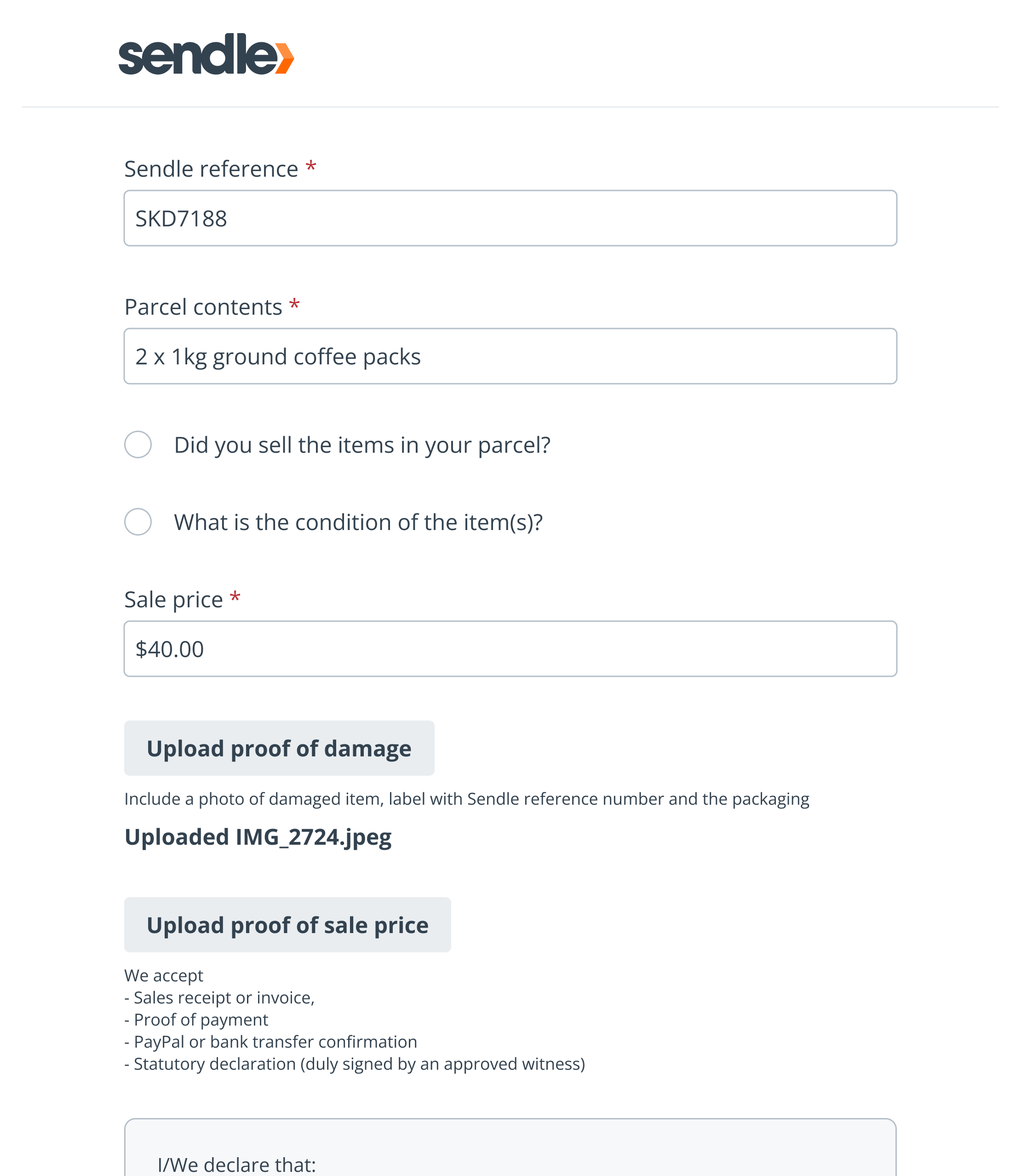
Saved product details
Many businesses sell a limited range of items. Having to re-enter cost, description, and receipt for the same product on every claim was frustrating. We let customers save this information for reuse.
Customers can save product details for future claims
The Results
- Support ticket handling time: 22 min → 15 min (-32%)
- Follow-up emails per ticket: 4.2 → 3.3 (-21%)
- Customer time to complete form: ~10 min → 13 min (+27%, intentional)
The increase in form completion time was intentional. The added structure ensured submissions were complete and correct on first attempt, reducing downstream support effort.
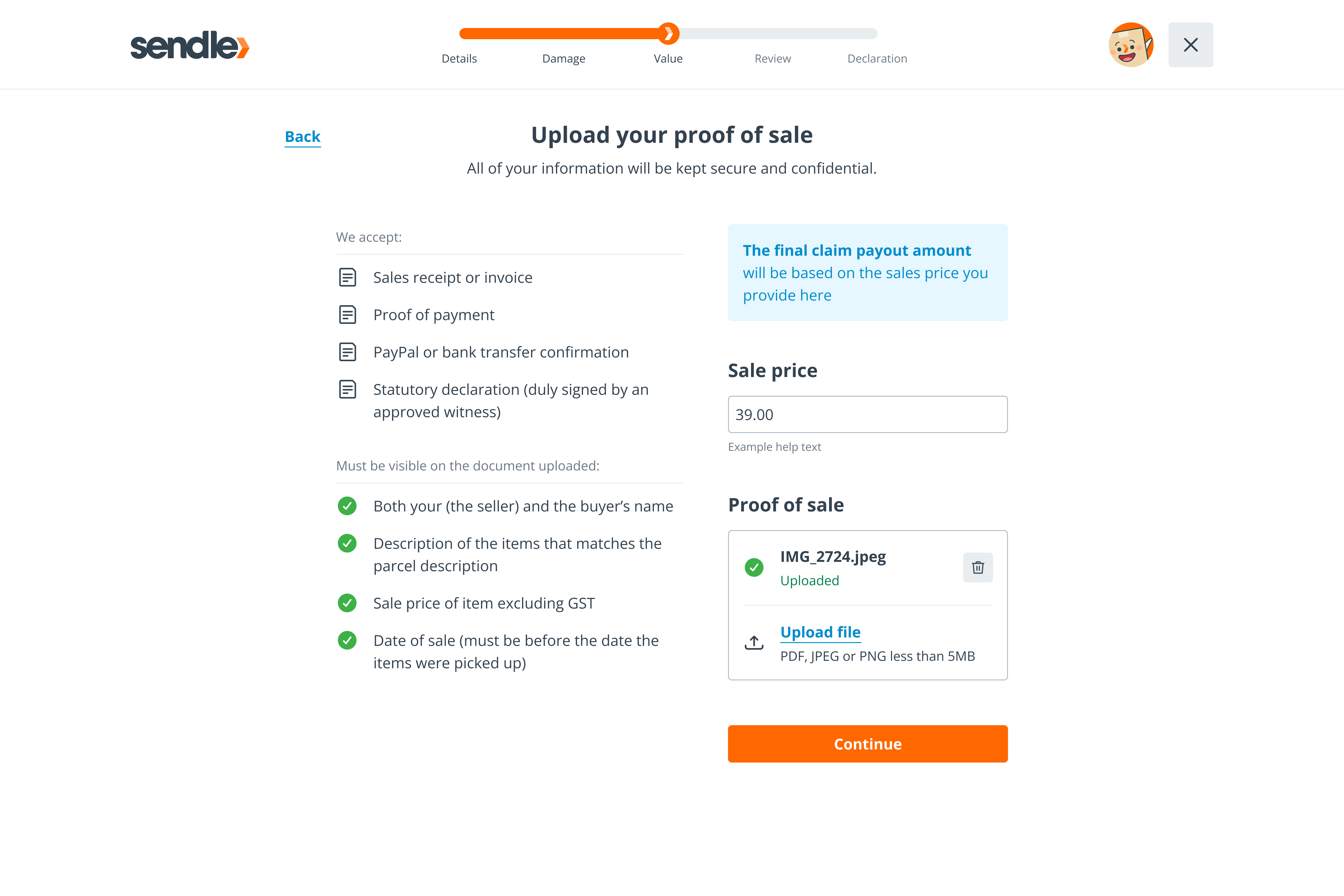
Redesigned claims journey with stepped progress
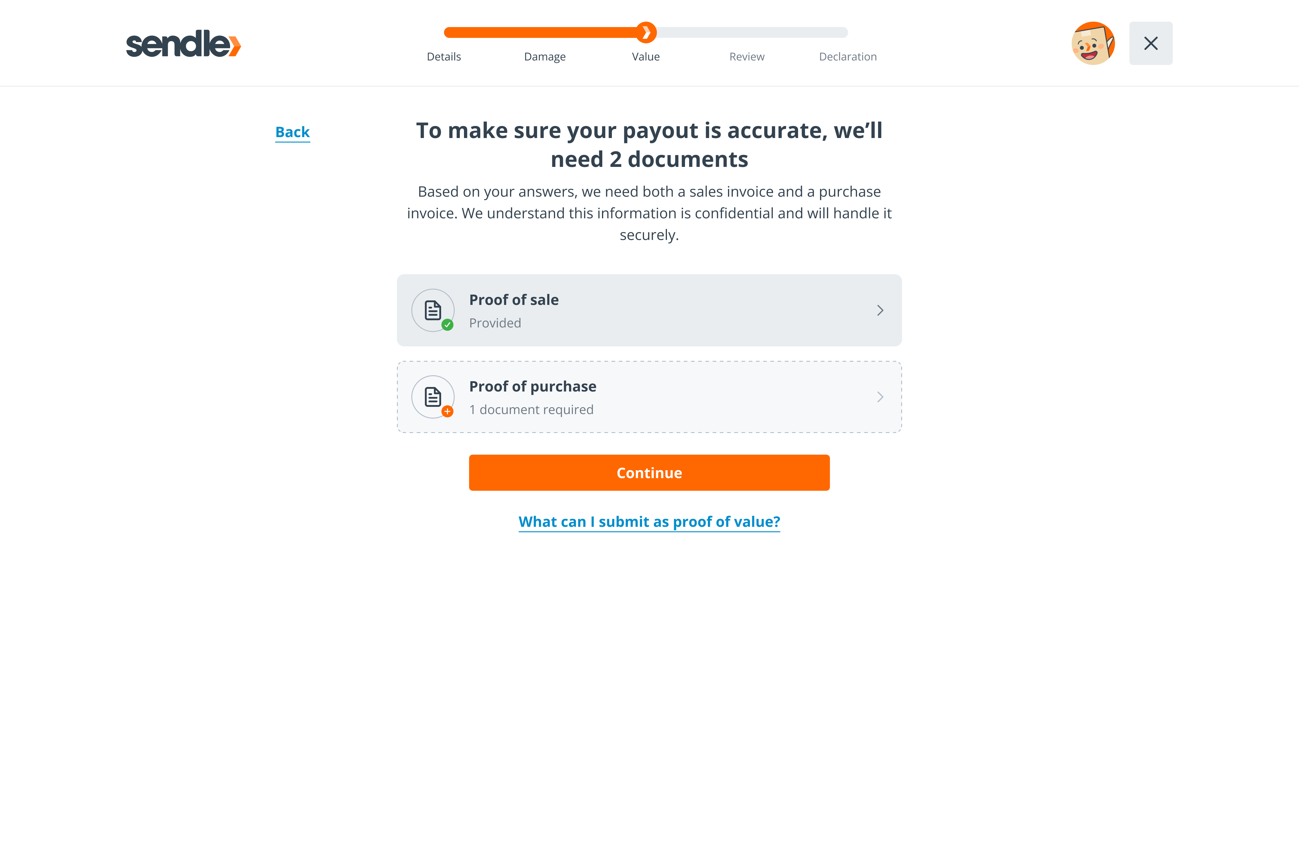
Structured inputs capture complete information upfront
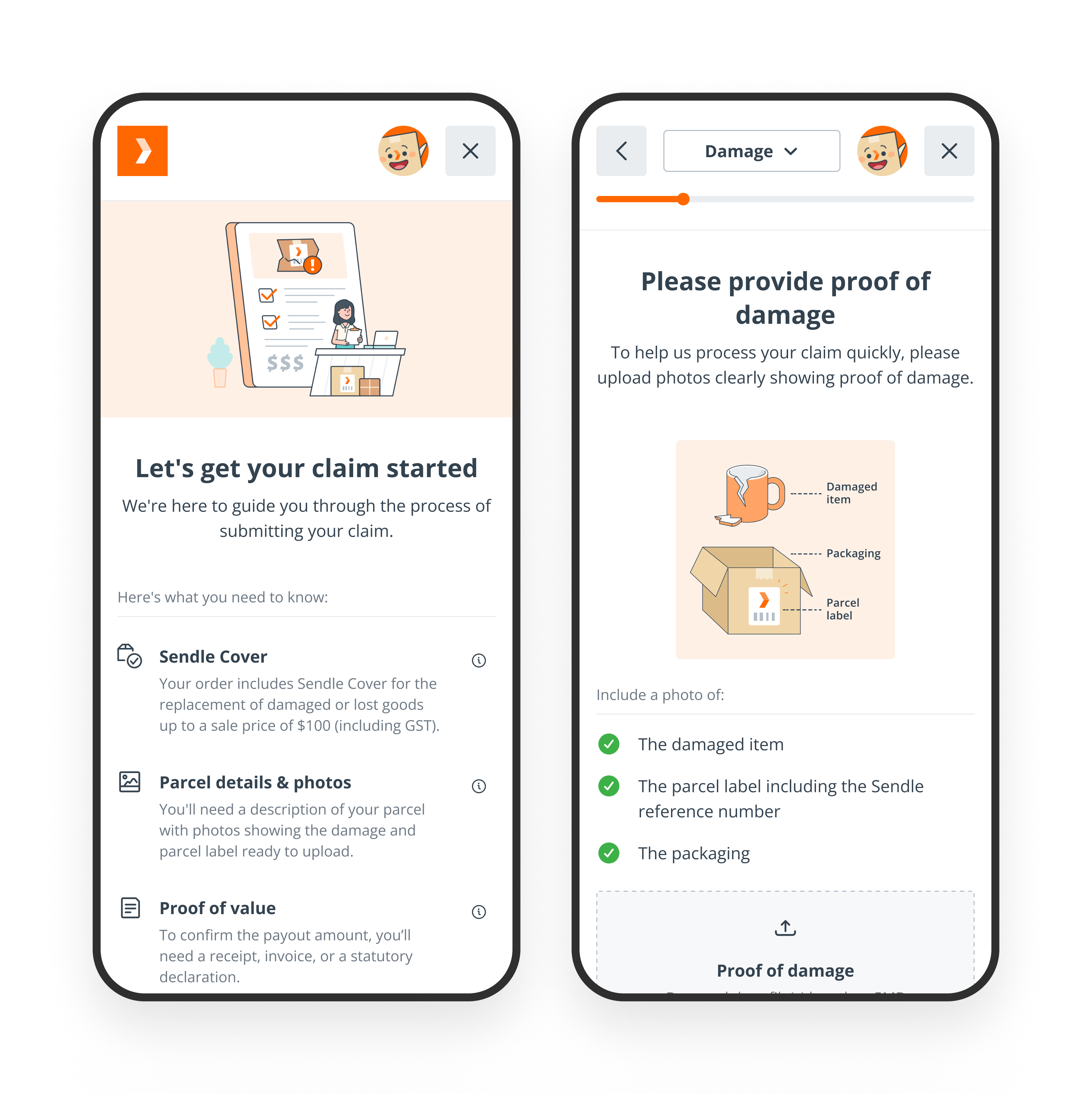
Mobile-first design for on-the-go small business owners
Broader Impact
The design system investment paid compound returns.
- Figma Make - The clean component structure meant Figma Make could generate new screens and variations faster, reducing design iteration time.
- Figma → MCP → Code - Partnering with the lead engineer, we connected the Figma design system to Claude Code via MCP server. The consistent naming conventions meant the AI could reliably interpret designs. Approximately 90% of claims screens were built in hours versus the estimated 2-week timeline. The final 10% was finessing and that would only get better over time.
- MissionMode - The stepped-journey pattern created for claims is now available for other jobs-to-be-done flows across
the platform. One solution became a reusable system. Next planned use: the booking deliveries flow.
Approximately 90% of claims screens were built in hours versus the originally estimated 2-week timeline.
The project paid twice — once for claims, once for the improved processes that followed
What I'd Do Differently
Looking back, I wouldn't have proposed a one-size-fits-all solution.
Our customers fell into distinct segments: low-value frequent claimers and high-value customers who rarely claimed. The process was identical for both, which didn't make sense.
One interview stuck with me. A customer said claiming a $10 item wasn't worth 30 minutes of his time.
That insight led to conversations with the Sales team about factoring claims costs into overall pricing and auto-approving claims below a certain threshold.
The best claims process might have been no claims process at all — at least for some segments.
Once the redesign had momentum, it was hard to change direction. The project was proving successful on its own metrics, but NPS for customers who'd made a claim remained mostly unchanged. We only received one post-launch report before the business shut down, so we couldn't fully validate this.
I also wish I'd explored more proactive approaches. In interviews, we discovered customers often photographed parcels before sending — both for their own records and to share with buyers. These photos would be useful for claims. This sparked an idea: show senders their claims analytics (e.g., claims per items sent). We later found Amazon does something similar with a dashboard. That direction never got explored.
Key Takeaways
- Positive friction can improve outcomes when balanced with convenience features like save-as-draft
- Design system investment pays compound returns — the Figma-to-code workflow accelerated all subsequent work
- Question the brief — sometimes the best solution isn't a better version of what was asked for